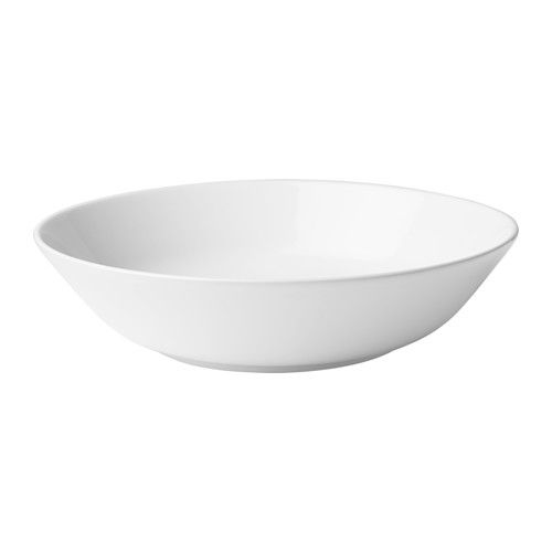
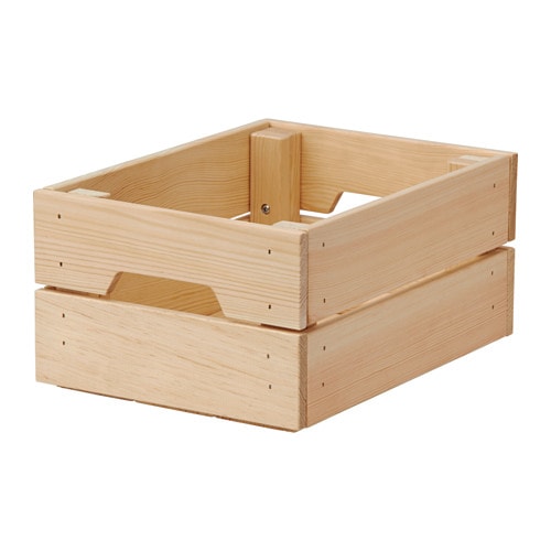
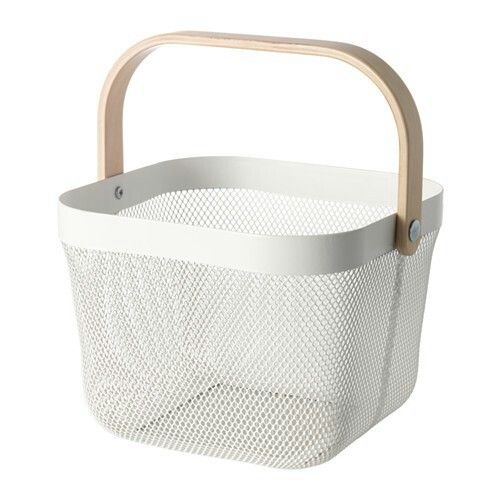
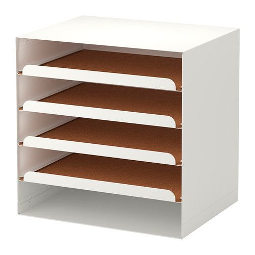
And two hours later at Ikea....
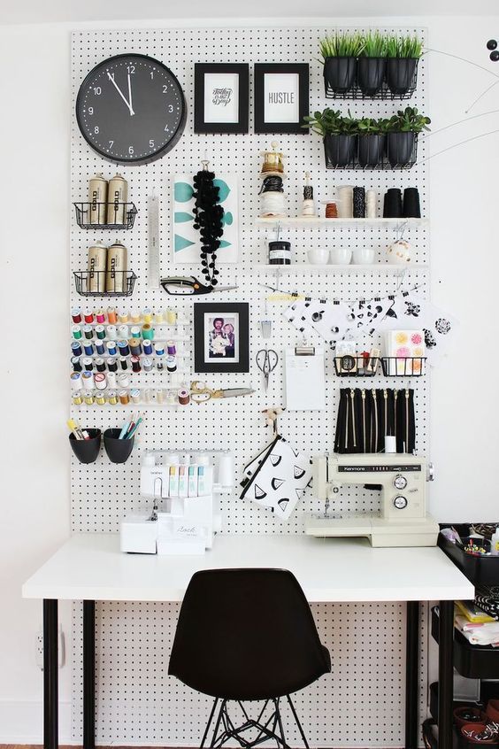
Let's talk a little about merchandising, shall we? Often we are faced with an odd shaped space, an odd shaped product and possibly even odder options in which to display said product upon. We have a vision and very little time to convey it. This vision is glorious isn't it? Probably an all white interior filled with shiplap, historic architectural details and well placed natural light. The reality is that many of us are working in a dimmer than ideal environment with patchy walls and spotlights that cast shadows. When faced with these very real challenges, I find the best solution is to create that 'blank canvas' of a backdrop for your product to shine upon. And this my friends is where Ikea comes in.
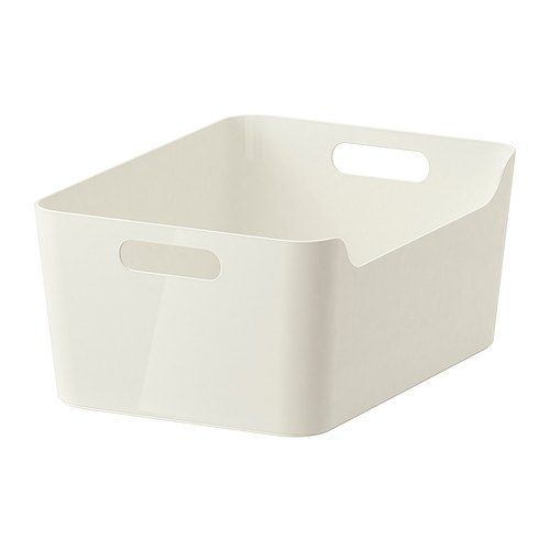
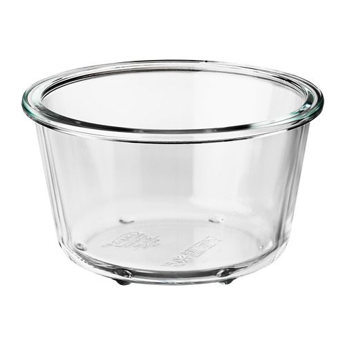
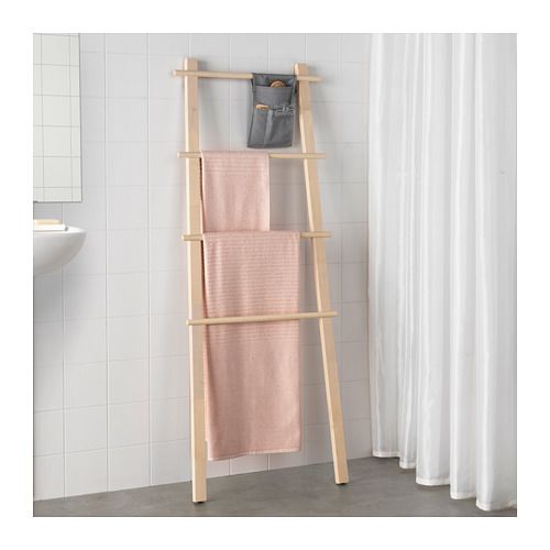
Ikea, land of all things Swedish, from meatballs, lost hours and to the most helpful of display items. Now I am certainly not discounting the displays one gets from vendors -- however, while often free, they are not as flexible or frankly, as pretty. And YOU. NEED. PRETTY. Your main objective with display pieces is sticking to one or two colors or textures. In a visually busy gift shop, you want the product to shine, and using a limited color palette will allow it to do so. You can't go wrong with white and your options are limitless. I would also suggest a natural wood or even grey's or black. See below a few great picks from our friends at Ikea that I have used or look forward to using.

